Profile & settings
As part of the Postman v12 release, I led product design for the profile and settings navigation within a broader company effort to simplify the product experience, focusing on clearer navigation, a more streamlined UI, and reduced clutter.
In three weeks, I defined, designed, and shipped a revamped profile and settings experience that achieved full adoption.
Do people need 2 menus?
-
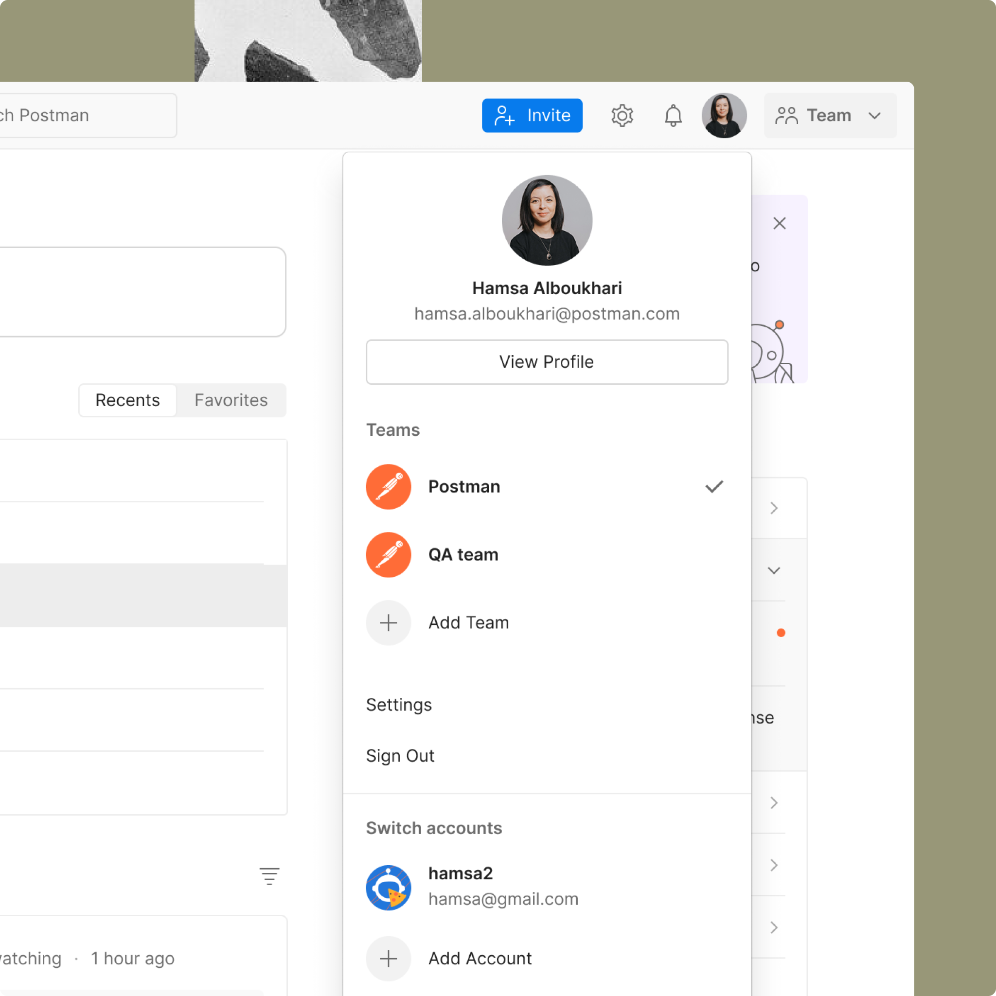
Profile menu
The product had two separate menus: one for the user profile, where individuals could view their personal identity in the product, see the teams associated with their account, and switch between accounts or teams.
-
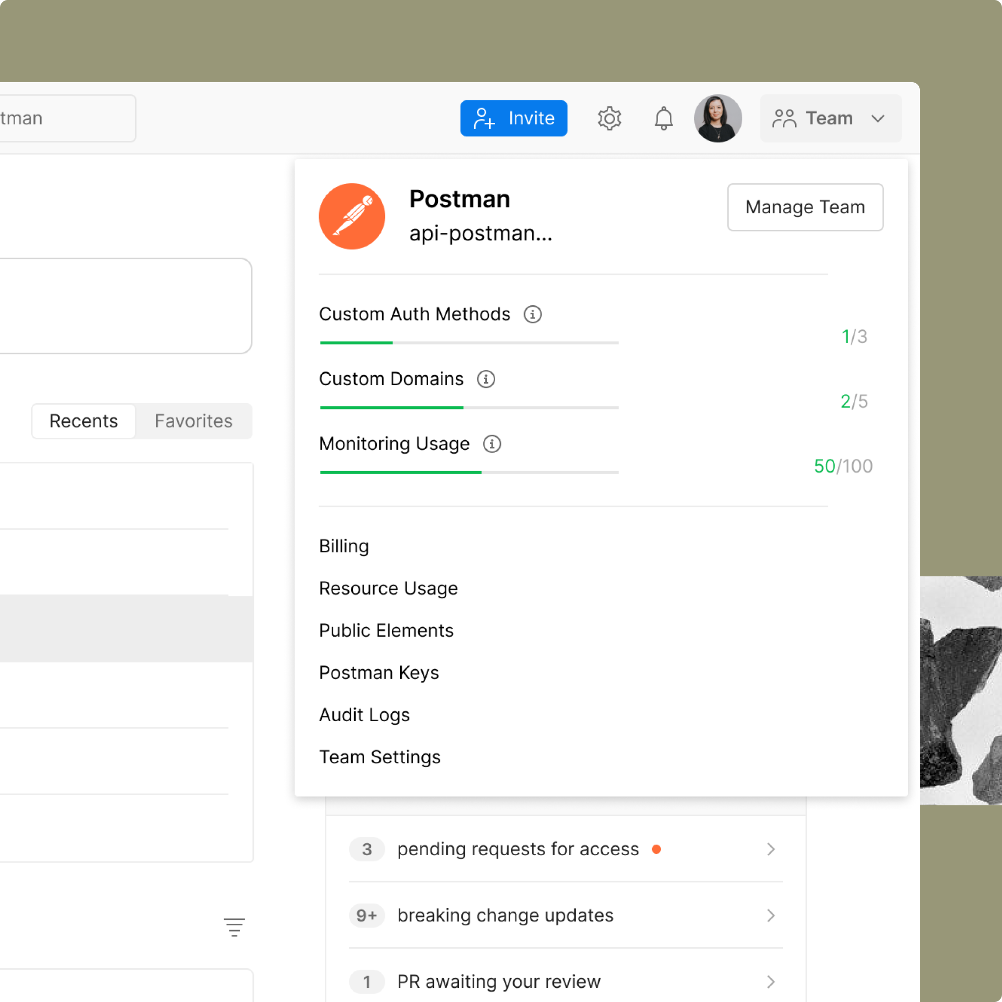
Team menu
The other menu focused on team management, providing access to plan usage and key settings such as billing and data management.
Settings, settings… settings?
Another issue was the repeated use of the label “Settings” across different entry points, without any clear distinction. These were also scattered across the product: workspace settings lived within the workspace, team settings in the team dropdown, account settings in the profile menu, and platform settings in a separate section.
What does simplicity mean?
As a first step, I needed to define what “simplicity” meant in the context of profile and settings navigation, so design decisions wouldn’t rely on instinct alone.
With only three weeks to understand and address a new problem space, I focused on forming clear hypotheses around where complexity was coming from. I conducted a heuristic and comparative analysis, met with stakeholders to understand how the system had evolved, and gathered as much existing user insight as possible. Since there wasn’t enough time to run a new study, I also relied on AI research assistants I had previously built to quickly extract and synthesize relevant user feedback. This helped ground early decisions in real signals rather than assumptions.
Key findings
Users struggled to locate specific settings
Many were unaware they were operating within a team context
Postman was largely perceived as an individual testing tool, not a collaborative platform
Mapping the system
-
![]()
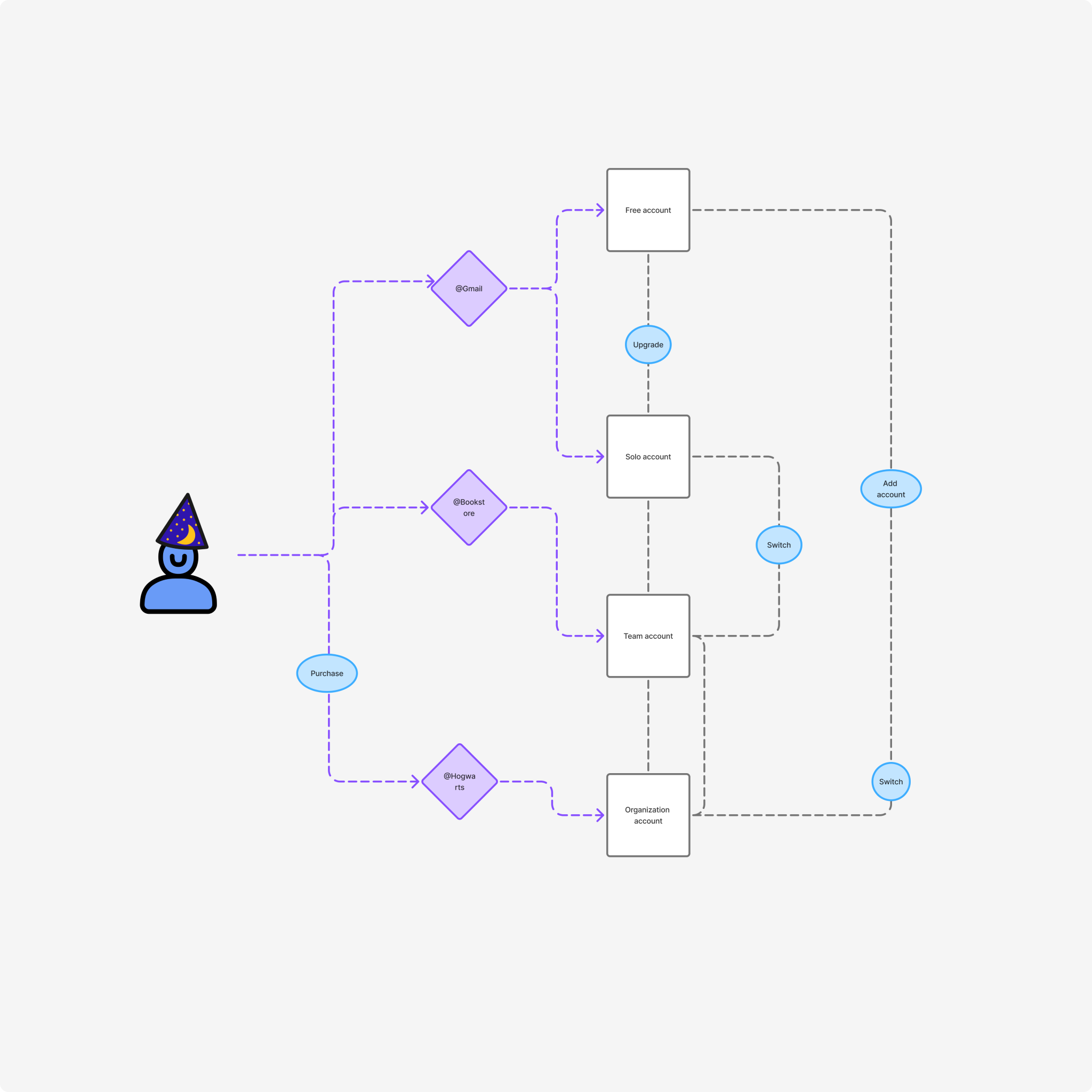
Defining key use cases
I started by mapping key use cases within the system to identify the workflows I needed to design for. This was grounded in my existing understanding of the product and its structure.
One example was users managing multiple accounts with different teams attached to each account. I broke this down into the core jobs to be done across these contexts, including switching between accounts and teams, upgrading plans, navigating between sections, and adding or removing access.
-
![]()
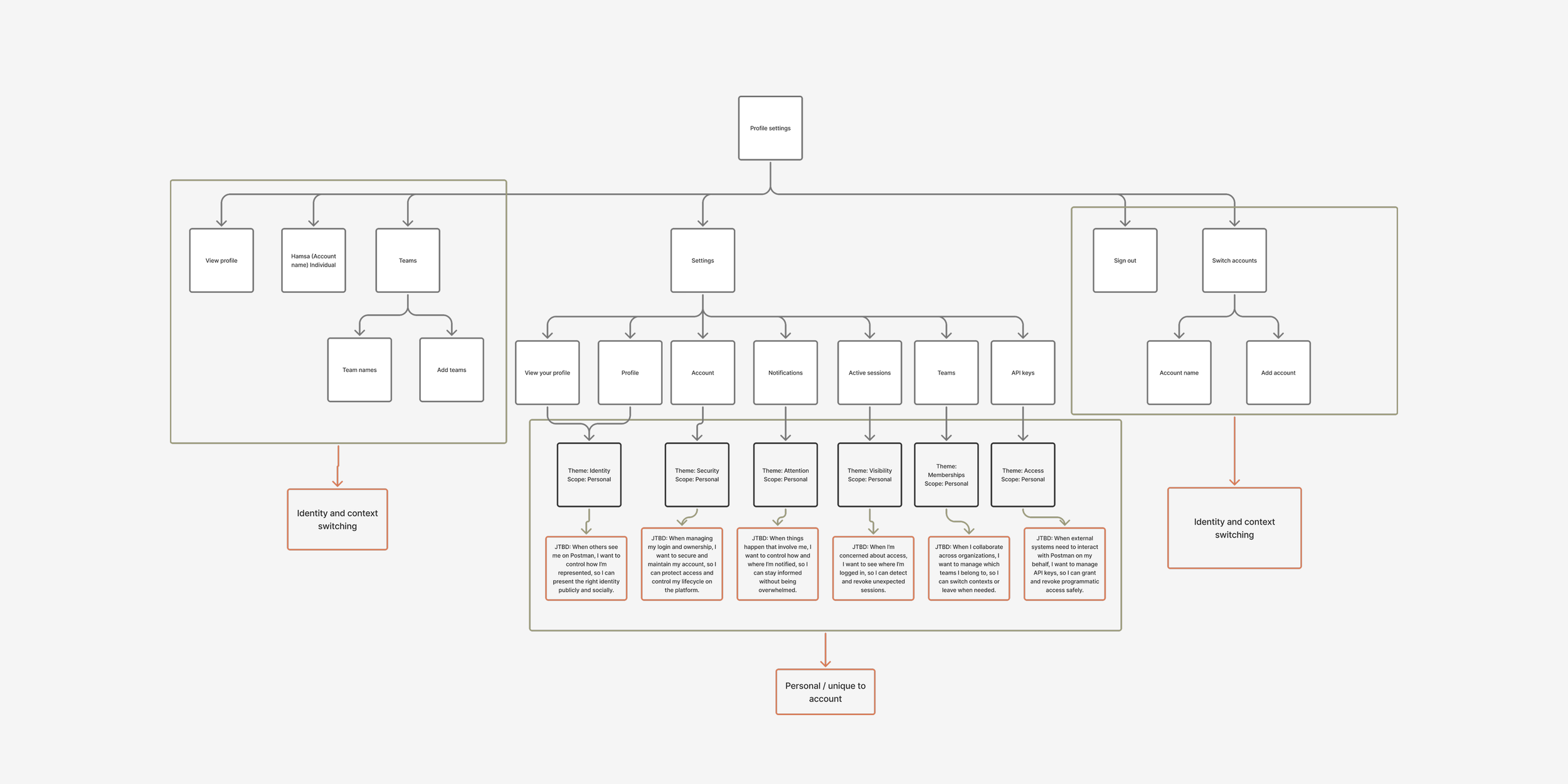
What do we call settings?
I mapped the information architecture of the settings ecosystem to identify the jobs-to-be-done tied to each function, with the goal of improving naming consistency and aligning with patterns used in other products.
From this analysis, I identified four distinct settings scopes: account, team, organization, and system settings. These labels aligned with industry standards and provided clearer, more descriptive ways for users to locate and understand where specific controls lived.
-
![]()
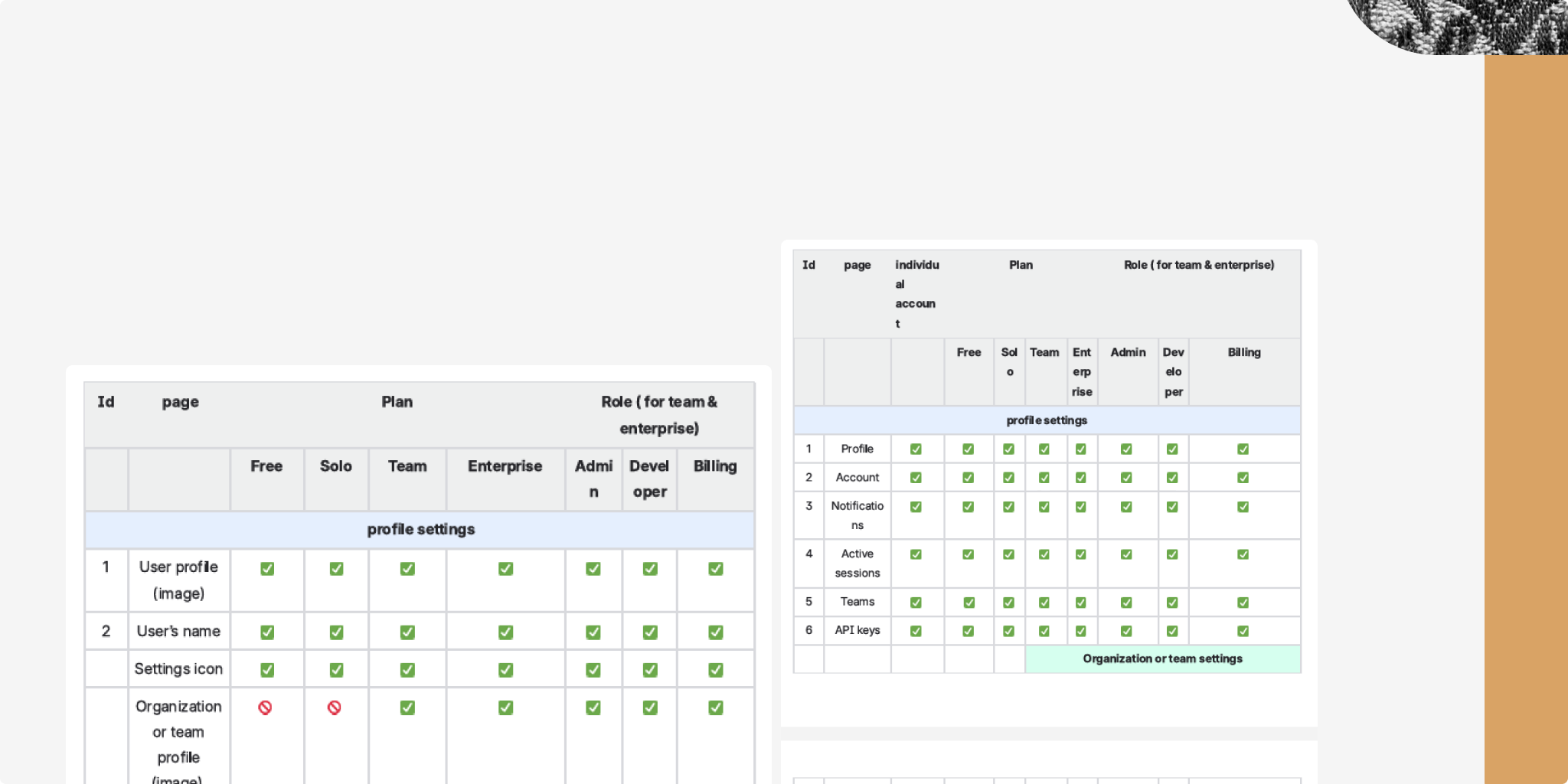
Validating the identity and settings system
To validate and align the different use cases and settings options across user roles and plans, I built structured matrices for both profile and settings. I then brought stakeholders together to review and validate the proposed structure against both system constraints and business logic.
Exploring external patterns
To identify stronger patterns, I reviewed how other complex platforms handle identity, hierarchy, switching, and settings organization—focusing on tools developers already use and understand, such as Notion, Atlassian, Google, and YouTube.
Findings:
Both GitHub and Atlassian rely on similarly complex navigation systems, with multiple layers and entry points that can make orientation harder.
In contrast, Notion and YouTube offered a clearer model: users can understand context at a glance, without needing to jump between screens to piece together relationships between elements.
Designing hypotheses
-
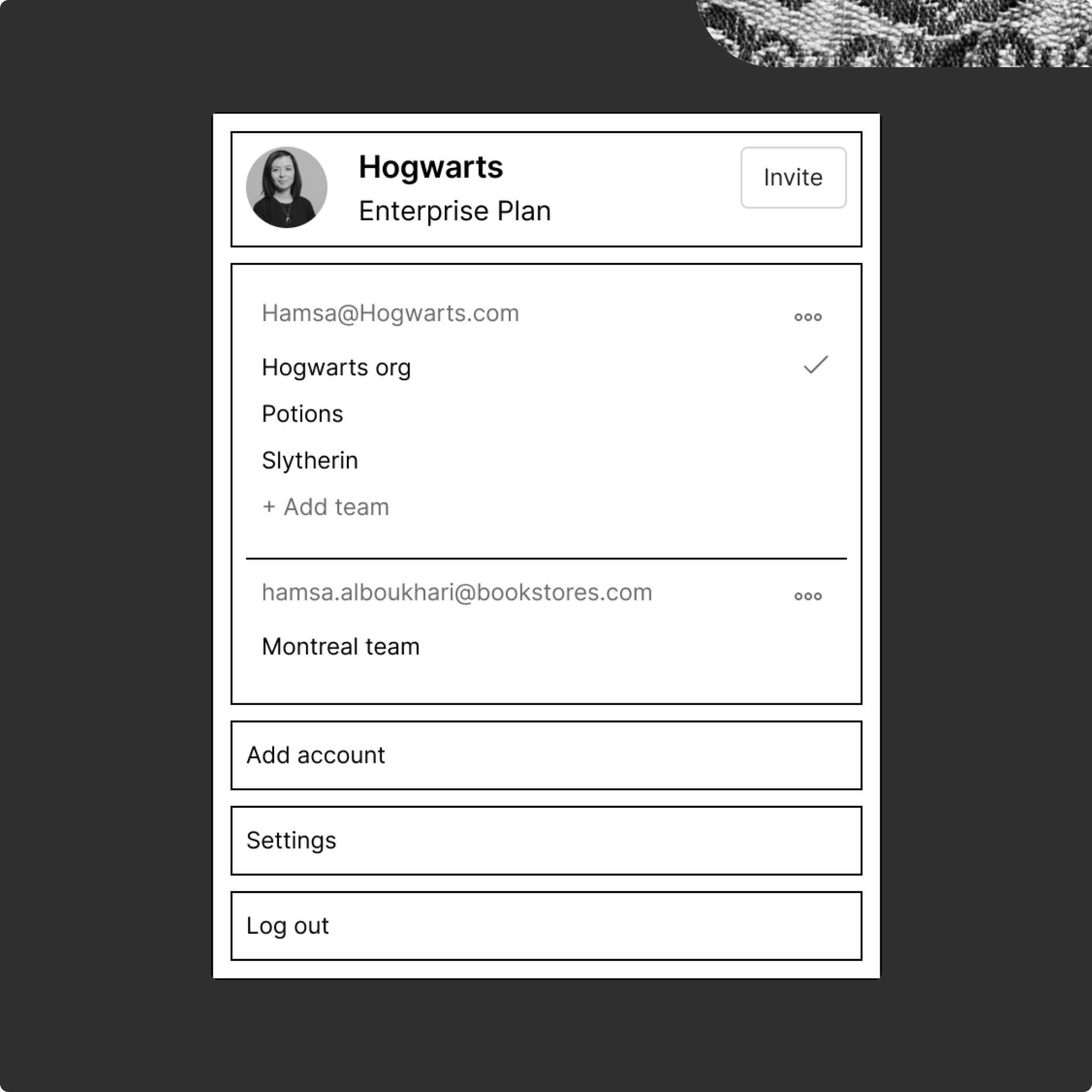
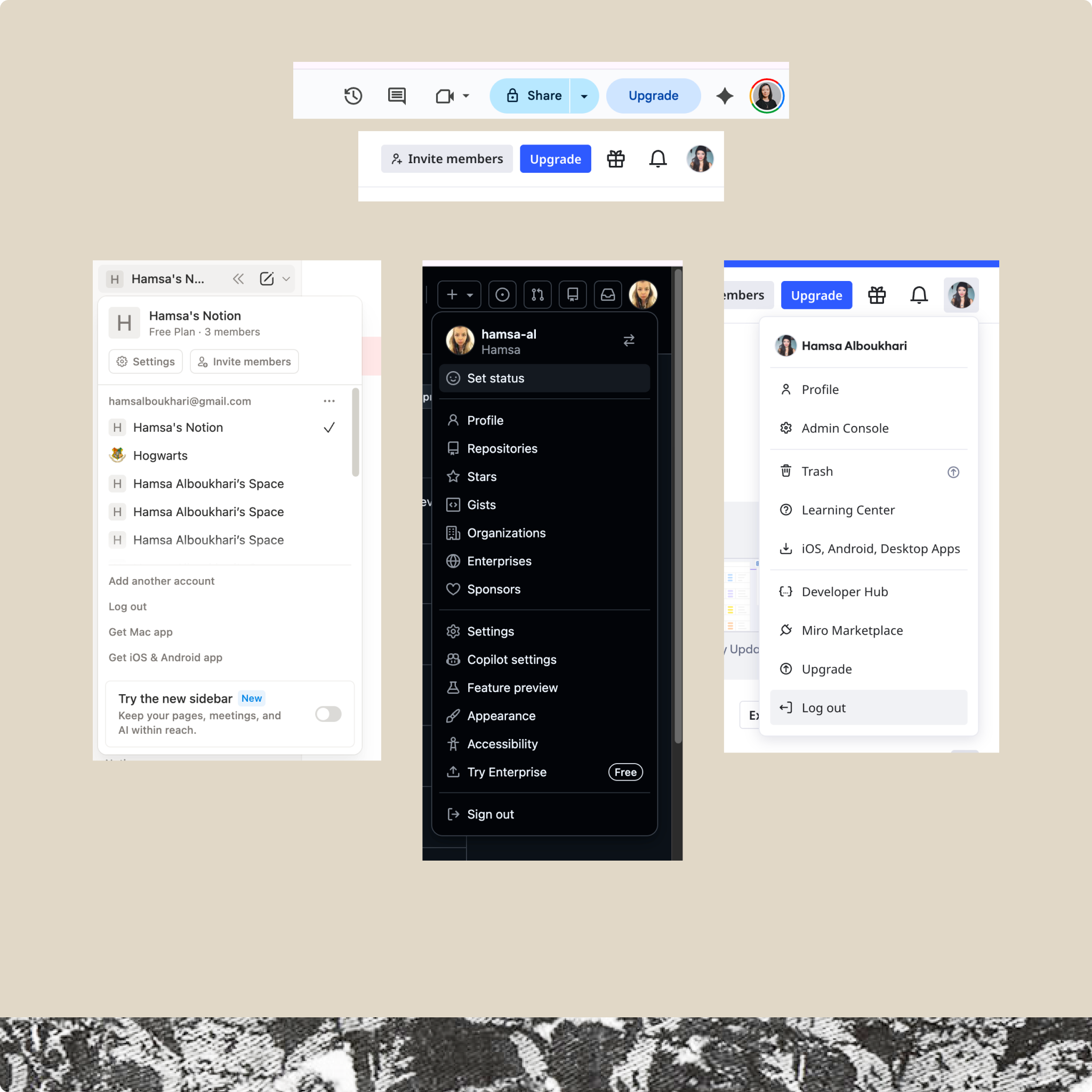
Team first approach
Based on my findings, I explored multiple design directions. The first direction prioritized the team as the primary identity. In this concept, the team name appeared at the top of the menu, followed by the user’s connected accounts and the teams associated with each account. A checkmark indicated the currently active team. I also included key actions such as adding an account, accessing settings, and logging out, and made the menu scrollable to support users connected to multiple accounts.
This approach effectively reinforced that users were operating within a team environment and made the collaborative context more visible by bringing the team relationship to the forefront. However, it also pushed the user’s individual identity too far into the background. As a result, it introduced ambiguity around which identity the user was acting under, reducing clarity at the individual level.
This direction was effective at reinforcing the idea that users were operating inside a team space. It made the collaborative context more visible and brought the team relationship to the forefront. However, it also made the user’s own identity feel too secondary. That created ambiguity around who the user was acting as within the product which weakened clarity at the individual level.
-
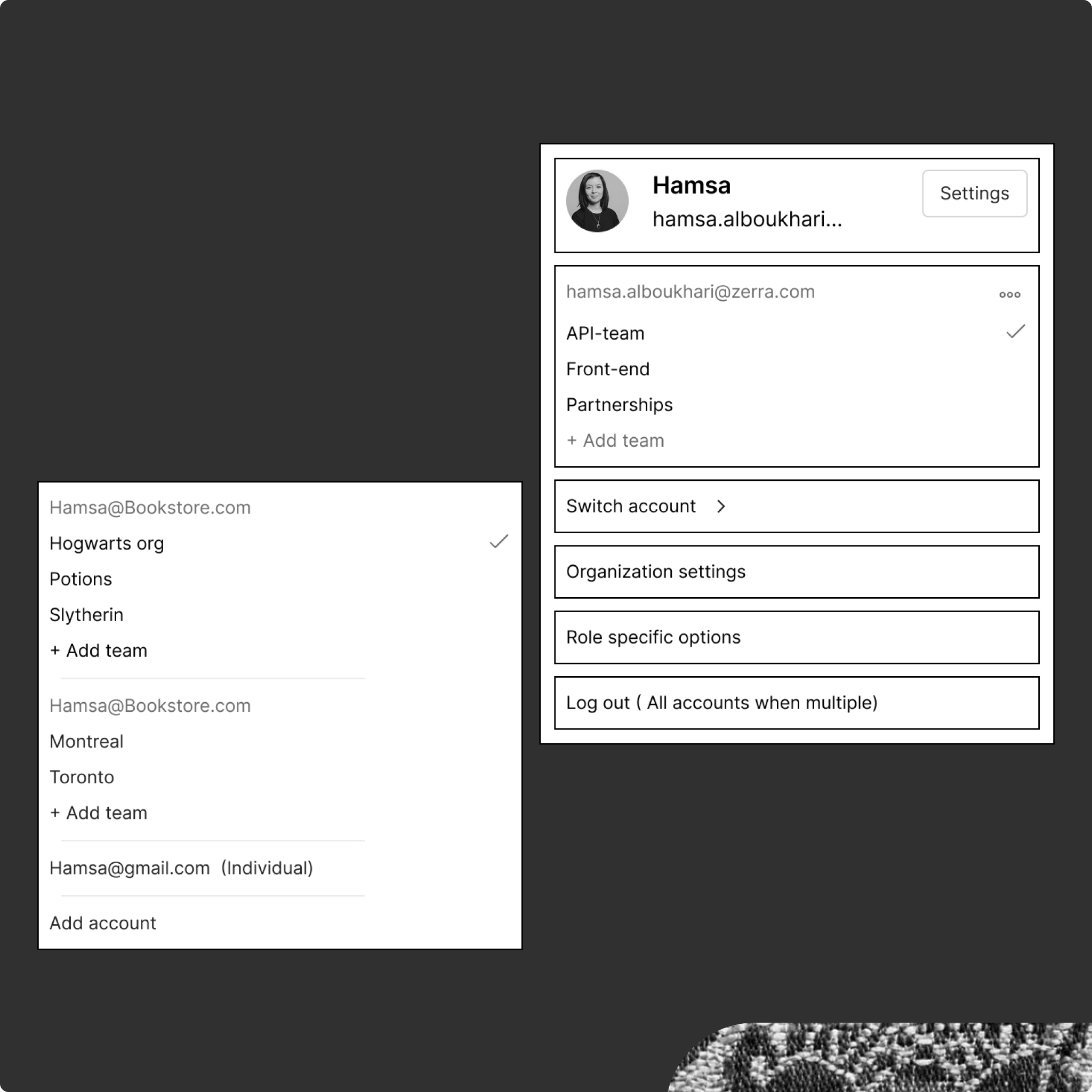
Account-first hierarchy
The second direction reversed that relationship, making the individual account the primary identity. In this model, the user account came first, with connected teams listed underneath.
I also explored a more explicit account-switching pattern by surfacing it directly in the menu instead of hiding it behind an additional click. The switcher displayed all connected accounts (identified by email), with their associated team names underneath and a checkmark indicating the active selection.
This approach improved clarity around the user’s personal identity and made account switching more visible. However, it came at the cost of diminishing the prominence of the team context. Since a key goal of the redesign was to reinforce that users operate within a shared team environment, this direction didn’t strongly support the intended mental model.
New profile and settings navigation
The experience was released to all users on March 1, 2026, alongside broader product updates. It achieved full adoption with no reported usability issues.
The final design combined both user and team identity, using the team’s logo layered on top of the user’s profile to signal both who the user is and where they are working. Context switching was consolidated into a subtle dropdown, as most users operated within a single team and did not require a highly prominent switching pattern. I also advocated for removing usage data, as it was not relevant to the user’s primary tasks.
All settings entry points were consolidated under a single settings icon, with workspace settings becoming active only when the user was within a specific workspace context.
Impact & results
The new experience was released as part of the broader V12 release and achieved full adoption, with no reported user complaints or UX issues.
A potential next step would be to reassess the necessity of having so many distinct settings sections and explore whether the structure could be simplified further without losing clarity or control.
I’d also be interested in understanding whether this new experience influenced how users perceive the product’s system hierarchy—specifically, whether it improved awareness of the team layer—and whether that shift had any impact on collaboration within the platform.